


Executive Overview
For nearly a decade, the digital dating landscape has been dominated by a familiar, repetitive formula: the rapid-fire swipe. Whether flicking left or right on Tinder, navigating Bumble, or hunting for meaningful connections on Hinge, modern singles have grown accustomed to a transactional, image-first mechanism. Millions of users experience digital fatigue, suffering from endless scrolling, shallow interactions, and the illusion of infinite choice that rarely translates into genuine compatibility.
Enter Hily—an acronym for "Hey I Like You"—a rising platform aiming to disrupt this status quo. Boasting a solid 4.4 out of 5.0 rating on the App Store and a primary demographic ranging from 18 to 30, Hily positions itself differently from its legacy competitors. Rather than prioritizing superficial visual chemistry above all else, the platform anchors its ecosystem in structural compatibility, shared values, and guided conversation tools.

To test these claims under real-world conditions, a rigorous, two-week testing period was conducted in the bustling, highly competitive dating market of New York City. The findings reveal an application that successfully slows down the decision-making process and encourages deliberate engagement. However, like any digital product, it comes with specific trade-offs, paywalls, and nuances that users should understand before diving in. This exhaustive review breaks down Hily’s mechanics, user experience, feature set, cost structure, and competitive standing in the modern matchmaking economy.
Detailed Chronology of the Two-Week Testing Period
Days 1–3: Onboarding, Profile Optimization, and the First Impressions
Setting up a dating profile on Hily requires more intentionality than standard photo-heavy platforms. Beyond uploading verified selfies (a robust security feature requiring a live photo match to ensure users look like their pictures), the onboarding phase prompts users to complete a series of interest badges and explicit dating goal indicators.

- The Dating Goal Signals: These tags are displayed directly on profiles, immediately clarifying whether a prospective match is seeking a serious relationship, casual dating, or friendship.
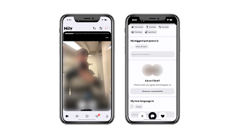
- The Vertical Swipe Mechanic: Departing from the industry-standard horizontal flick, Hily utilizes an up-and-down swipe motion—swiping up to like and down to pass. While seemingly minor, this mechanical shift forces a micro-pause, prompting the user to actually read the bio and inspect interest tags before making a judgment call.
During these initial days in New York City, the user base appeared geographically broad, though finding a hyper-local cluster required expanding the search radius to roughly 20 miles—a notable hurdle in a metropolis where car ownership is uncommon.
Days 4–7: Mastering the Discover and Likes Pages
By the middle of the first week, the novelty of the onboarding phase gave way to daily app habits. This is where Hily’s design philosophy truly differentiates itself from infinite-scroll competitors.

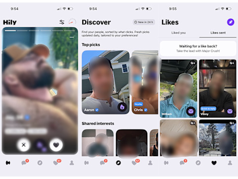
- The Discover Page: Refreshing every 24 hours, this curated hub divides profiles into three distinct sections: Top Picks, profiles sharing identical interest badges, and profiles with matching dating goals. Instead of dumping hundreds of faceless profiles onto the screen, the Discover page establishes healthy psychological stopping points. Browsing feels like reading a curated newsletter rather than digging through an endless digital landfill.
- The Likes Page: Hily eliminates the guessing game of who has expressed interest by housing all incoming likes in a centralized tracker, accompanied by a separate tracker for outgoing likes. However, a catch quickly emerged: the free tier limits viewable likes to roughly 20 profiles. Additional incoming likes remain blurred until unlocked via a daily in-app "Roulette" spin or a paid membership upgrade.
Days 8–11: The Compatibility Quiz and Conversation Tools
The second week focused heavily on Hily’s analytical capabilities, specifically its extensive 50-question compatibility quiz and automated conversation prompts.
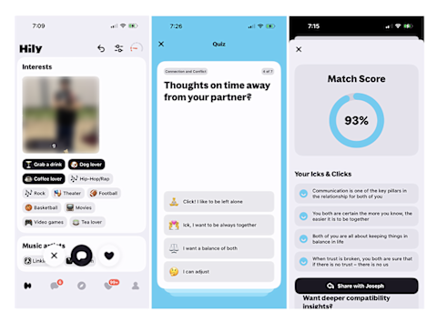
- The Compatibility Check: As users answer questions ranging from lifestyle habits to core values, Hily generates a live compatibility percentage that appears on prospective profiles. However, early testing revealed a critical caveat: complete the entire quiz before evaluating matches. Testing a profile at the 15-question mark showed a 100% compatibility rating; upon finishing all 50 questions, that same match plummeted to 69%.
- Breaking the Ice: Once a match is secured, Hily surfaces mutual interests inside the chat interface and offers pre-generated conversation starters, icebreakers, and playful prompts. This significantly lowers the friction of sending that dreaded first message, moving conversations past generic greetings like "hey" into substantive dialogue.
Days 12–14: Monetization Evaluation and Final Verdict
The final phase of testing evaluated the value proposition of Hily’s paid tiers versus its generous free version. By winning a complimentary three-day trial via the daily Roulette wheel, the differences between standard and premium features became starkly clear, leading to a comprehensive assessment of the app’s long-term viability.

Supporting Context & Metrics: Hily vs. The Competition
To fully understand Hily’s market position, it is essential to evaluate its architecture and user metrics against industry heavyweights like Bumble, Tinder, and Hinge.
| Feature / Metric | Hily | Tinder | Bumble | Hinge |
|---|---|---|---|---|
| Primary Focus | Compatibility & Shared Values | Speed, Volume, & Visuals | Empowered Connections & Intent | Prompt-Driven Storytelling |
| Swipe Mechanics | Vertical (Up/Down) | Horizontal (Left/Right) | Horizontal (Left/Right) | Vertical / Profile Scrolling |
| Compatibility Tools | 50-Question Quiz & Interest Badges | Minimal / Algorithm-Driven | Basic Filters | Prompts & Preference Filters |
| U.S. User Base | Moderate (Growing) | Massive | Massive | Large & Highly Active |
| Free Tier Generosity | High (Access to Discover, Likes, & Chat) | Moderate (Limited Likes) | Moderate | Moderate (Daily Like Limits) |
Cost Breakdown and Pricing Tiers
Hily provides a surprisingly robust free tier that allows users to scroll, utilize the Discover page, browse incoming likes, and chat without spending money. For power users seeking advanced features, Hily offers tiered subscription models:
- Weekly Subscriptions: A low-risk option for short-term testing.
- Monthly, Quarterly, and Annual Plans: Scaled pricing designed for long-term users.
- Premium Perks: Unblurring all incoming likes, unlimited "Mega Crushes" (Hily’s equivalent of a Super Like), advanced search filters, and priority profile placement.
- Cancellation Policy: Subscriptions must be managed and canceled explicitly through the user’s mobile device app store settings (iOS App Store or Google Play Store); simply deleting the application does not terminate active billing renewals.
Official Insights and Platform Philosophy
According to platform developers and product design notes, Hily was engineered to counteract "swipe fatigue"—a psychological phenomenon documented by psychological researchers where continuous binary choice-making leads to emotional detachment, cynicism, and rapid burnout among dating app users.
By integrating psychological compatibility metrics with behavioral design choices—such as the vertical swipe and daily-refreshing Discover feeds—Hily attempts to restore intentionality to mobile courtship. Company data underscores that profiles utilizing complete interest badges and verified selfie status receive significantly higher engagement rates, proving that modern daters are increasingly craving context over superficiality.
Future Outlook: Is Hily Worth Your Time?
As the digital dating market matures, platforms that fail to evolve beyond superficial photo swiping are steadily losing favor with demographics seeking genuine relationships. Hily occupies a valuable middle ground: it retains the accessibility and modern user interface of mainstream apps while introducing deep compatibility frameworks typically reserved for niche, expensive matchmaking services.
The Pros:
- Thoughtful user interface and vertical swipe mechanism that encourages reading bios.
- Highly functional, curated Discover page that prevents endless scrolling exhaustion.
- Verified profile system ensuring authentic user identities.
- Generous free tier that remains usable without an immediate financial commitment.
The Cons:
- Smaller U.S. user base compared to tech giants like Tinder or Bumble, requiring larger geographic search radiuses in non-metropolitan areas.
- Analytical features like the full compatibility breakdown require careful patience and complete survey completion to avoid misleading early metrics.
- Premium features (such as fully unblurring all incoming likes) sit behind a paywall.
Final Recommendation
For singles exhausted by the superficial mechanics of traditional swipe-first platforms, Hily is well worth downloading. By completing the full 50-question compatibility quiz, optimizing interest badges, and leaning into the curated Discover page, users can bypass much of the digital noise. While it may not yet boast the raw user volume of Tinder in every corner of the country, Hily delivers a refreshing, structured, and ultimately more intentional pathway toward modern connection.