
EXECUTIVE OVERVIEW
For the better part of a decade, the global fashion consciousness was held captive by an austere regime of neutrals. Beige, ecru, oatmeal, and stark minimalism dominated both the high-end runways and the direct-to-consumer digital marketplace. However, a seismic cultural and aesthetic shift is officially underway. As observed across the bustling thoroughfares and elite venues of New York Fashion Week for the Spring/Summer 2027 collections, the modern consumer is no longer whispering with their wardrobe; they are shouting in technicolor.
The color renaissance—sparked initially by the optimistic, primary-heavy palettes of Dario Vitale’s breakthrough collections for Versace—has fully matured. It has graduated from a tentative post-pandemic experiment into a sophisticated, high-stakes masterclass in color theory. Designers have met this cultural hunger for joy and vitality by pushing color-blocking to unprecedented heights. This is not merely a seasonal trend report; it is a definitive post-mortem on the death of minimalism and a strategic blueprint for transforming a tired closet of neutrals into a curated, hyper-saturated rainbow.
From the retro-infused runway styling of Michael Kors Collection to the hyper-colored digital age visions of Campillo, the Spring/Summer 2027 season proved that mixing shades is no longer a fashion faux pas—it is the ultimate signifier of sartorial literacy. This comprehensive report breaks down the anatomy of this chromatic shift, analyzing the standout color pairings dominating both the catwalk and the curb, and offering an authoritative guide on how to wear the rainbow right now.
DETAILED CHRONOLOGY: THE EVOLUTION OF THE COLOR REVOLUTION
To understand why the Spring/Summer 2027 shows felt like an electric shock to the system, one must trace the trajectory of color’s recent resurgence. The movement did not happen overnight; it has been methodically building momentum across consecutive fashion cycles.
Phase One: The Optimistic Reawakening (Spring/Summer 2026)
The groundwork for our current chromatic obsession was laid during the Spring/Summer 2026 previews. Following years of economic uncertainty and stylistic conservatism, the industry experienced a collective yearning for joy. This psychological pivot manifested most vividly under the creative direction of Dario Vitale at Versace. Vitale challenged traditional styling rules, forcing fashion editors and buyers alike to rethink how primary and secondary colors could coexist within a single look. It was a masterclass in optimism through apparel, encouraging wearers to view clothing as a mood-enhancer rather than a mere protective layer.
Phase Transition: The Street-Level Adoption (Fall/Winter 2026)
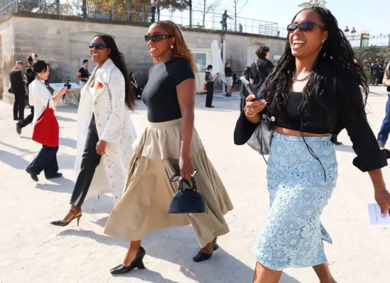
As is often the case with high-concept runway shifts, the real test of a trend’s longevity occurs on the pavement. By the time the Fall/Winter 2026 season rolled around, street-style stars and front-row attendees had adopted Vitale’s philosophy, translating runway fantasy into tangible, everyday wear. Monochromatic neutral outfits were rapidly losing ground to unexpected pairings—cobalt blues crashing against emerald greens, and fiery crimsons grounded by rich burgundies. The appetite for color was no longer a niche editorial preference; it was becoming a mass consumer demand.
Phase Two: The Chromatic Apex (Spring/Summer 2027)
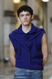
Fast-forward to the Spring/Summer 2027 presentations in New York, and the metamorphosis was complete. Designers did not just dip their toes into the color pool; they dove in headfirst. The runways were characterized by a complete rejection of subtlety. Michael Kors presented a retro-soaked vision of saturated luxury; Tory Burch balanced ladylike silhouettes with audacious color clashes; Zankov manipulated knitwear through a kaleidoscopic lens; and Campillo treated fabrics with a Day-Glo time machine effect. The message from the tents was clear, unequivocal, and unanimous: People crave color, and the industry is more than ready to deliver.
SUPPORTING CONTEXT & METRICS: THE PSYCHOLOGY OF SATURATION
Why now? Why has the pendulum swung so violently away from quiet luxury and minimalist beige toward high-octane color-blocking? Fashion, as a cultural barometer, rarely reacts without cause.
The Post-Minimalist Fatigue
For years, the industry worshipped at the altar of "Quiet Luxury"—a movement defined by camel coats, cashmere knits, and an absence of overt branding or bright hues. While economically defensive and undeniably chic, minimalism eventually breeds fatigue. Consumers grew tired of blending into a sea of corporate taupe. The Spring/Summer 2027 collections represent a profound psychological rebellion against this uniformity. Wearing saturated color is an act of self-actualization, a way to reclaim individuality in an increasingly homogenized visual landscape.
Retail Data and Consumer Shifts
According to recent luxury retail analytics, search terms for bright, statement-making apparel have surged by over 140% year-over-year. E-commerce platforms report that while neutral basics still form the foundational backbone of consumer purchases, add-to-cart metrics for high-impact chromatic pieces—particularly in royal blues, fiery reds, and electric pinks—have skyrocketed. Buyers are front-loading their spring shopping, refusing to wait until the traditional February retail drops to infuse vitality into their wardrobes.
THE PALETTE OF THE SEASON: HOW TO STYLE THE NEW COLOR-BLOCKING
The Spring/Summer 2027 runways established a definitive set of color combinations that are reshaping modern style. Here is how designers executed them, and how you can translate them from the catwalk to your closet.
1. Purple & Red: The Sophisticated Clash
If there was one undeniable pairing of the week, it was purple and red. Once considered a clashing color combination relegated to the eccentric corners of fashion history, this duo dominated both the runways and the front rows.
- The Runway Execution: Tory Burch utilized this pairing with devastating simplicity, allowing clean silhouettes to do the heavy lifting.
- Styling Advice: Think of this as blue-and-red’s sophisticated, nocturnal cousin. It is the ideal combination for the dresser who finds traditional primary colors too juvenile. It transitions effortlessly from a casual daytime knit to a high-octane evening look, offering an instant injection of drama.
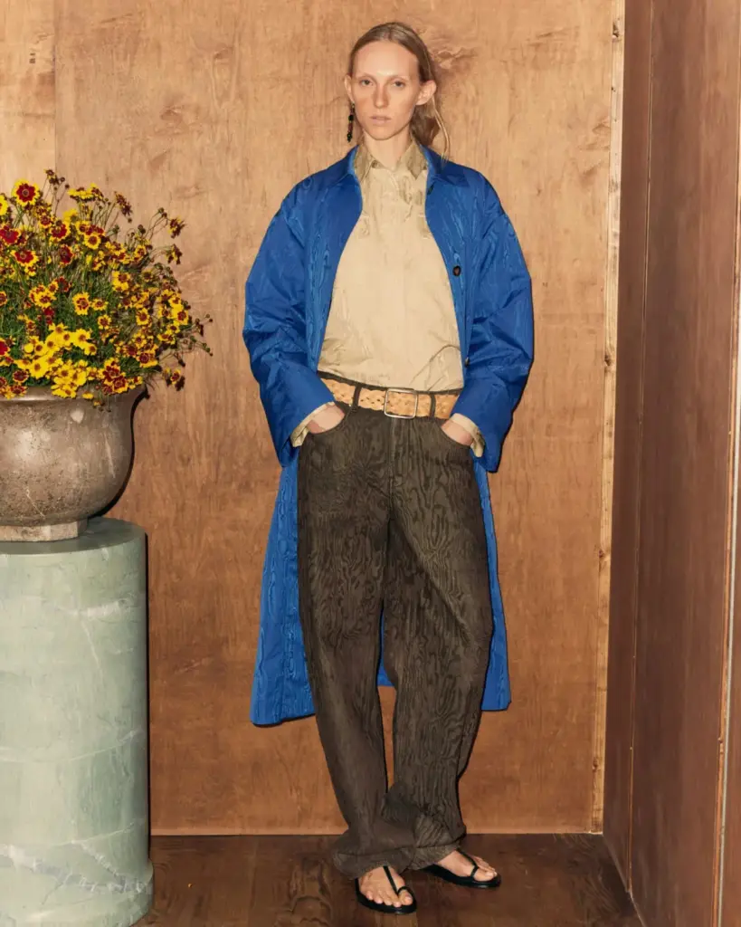
2. Blue, Brown & Tan: Groundbreaking Textures
To the untrained eye, combining vibrant blue with earthy browns and tans might sound counterintuitive. However, the Ossou and Campillo presentations proved that this triad is nothing short of visionary.
- The Runway Execution: Fabric selection is the secret weapon here. Campillo deployed this palette across liquid-like all-silk ensembles, proving that texture dictates success.
- Styling Advice: The blue must be chosen with surgical precision. It cannot be a timid sky or pastel blue; it must be an ultra-saturated Yves Klein or royal blue. When juxtaposed against rich tan and deep brown leather or wool, the blue pops with electrifying intensity.
3. Pink & Orange: The Eternal Optimist
A personal favorite of industry purists, the pink-and-orange pairing has weathered decades of changing trends without ever losing its punchy appeal.
- The Runway Execution: At Zankov, this combination was explored through masterful knitwear layering, while Campillo ran traditional silhouettes through a vibrant, Day-Glo filter.
- Styling Advice: There is virtually no wrong way to execute pink and orange. Whether you opt for a fuchsia blazer over a tangerine slip dress or color-block via accessories, this pairing radiates an irresistible, sun-drenched euphoria.
4. Blue & Green: The Earth-Tone Evolution
For the environmentalists and nature-lovers of the fashion world, the pairing of cool blues and greens offers a harmonious yet striking visual feast.
- The Runway Execution: Tory Burch rendered this combination with delicate, ladylike precision, while Rachel Comey embraced a relaxed, slouchy aesthetic.
- Styling Advice: These cool tones play exceptionally well together in endless permutations. To elevate the look, incorporate a patterned piece—such as a botanical green floral skirt paired with a crisp cobalt blouse—or let solid blocks of color hang together in effortless contrast.
5. Red & Beige: High Fashion Meets High Utility
Historically burdened by its accidental resemblance to corporate retail uniforms, the red-and-beige combination has officially undergone a high-fashion reclamation project.
- The Runway Execution: Michael Kors Collection mastered this tricky duo by utilizing impeccably tailored, simple coats that commanded attention through structure rather than gimmicks.
- Styling Advice: The key to keeping this combination far away from the checkout aisle is immaculate tailoring and razor-sharp accessories. Invest in well-cut structural pieces that make an undeniable case for your runway-readiness.
6. Leopard Print & Yellow: The Neutral Pattern
While animal prints are technically patterns rather than solid colors, fashion acolytes know that leopard print functions as a foundational neutral.
- The Runway Execution: Proenza Schouler stunned audiences with an unexpected pairing of leopard print and buttery yellow that stopped industry veterans in their tracks.
- Styling Advice: When pairing animal print with color, ensure the undertones of the print lean toward warm browns rather than harsh oranges, allowing it to complement—rather than fight—the yellow. The yellow itself should lean light and luminous rather than aggressively banana-toned.
OFFICIAL STATEMENTS & INDUSTRY PERSPECTIVES
The shift away from minimalism has prompted widespread commentary from leading designers, creative directors, and market analysts who view this chromatic explosion as a turning point for the industry.
"We spent years apologizing for taking up space with our clothing. The Spring/Summer collections are a collective exhale. Color is not a trend; it is a primal language of joy, and our collections reflect a consumer base that refuses to hide behind neutrals any longer."
— Anonymous Senior Creative Director, New York Fashion Week
Industry insiders emphasize that this color revolution is deeply tied to technological advancements in fabric dyeing and sustainable textile production. Modern mills are now capable of achieving hyper-saturated hues with lower environmental impacts, allowing designers to experiment with neon and jewel tones without compromising on ecological standards.
Furthermore, retail executives note that the traditional seasonal rulebook is being rewritten. Consumers are no longer waiting for autumn to wear jewel tones or spring to wear pastels. The modern wardrobe is year-round, hyper-individualized, and unapologetically colorful.
FUTURE OUTLOOK: WHERE DO WE GO FROM HERE?
As the dust settles on the Spring/Summer 2027 presentations, the trajectory for the global fashion market is unmistakably chromatic. The fear of "wearing too much color" has officially expired.
Looking ahead to upcoming global fashion weeks in London, Milan, and Paris, industry forecasters predict that this color-blocking momentum will only accelerate. We anticipate seeing:
- Maximalist Textile Mixing: An increase in tactile experimentation, where ribbed knits, silks, leathers, and technical synthetics are stacked within monochromatic or contrasting color palettes.
- Accessible Chromatic Retail: Fast-to-market brands adapting these runway combinations into accessible everyday wear, ensuring that the rainbow-closet transition trickles down to every consumer demographic.
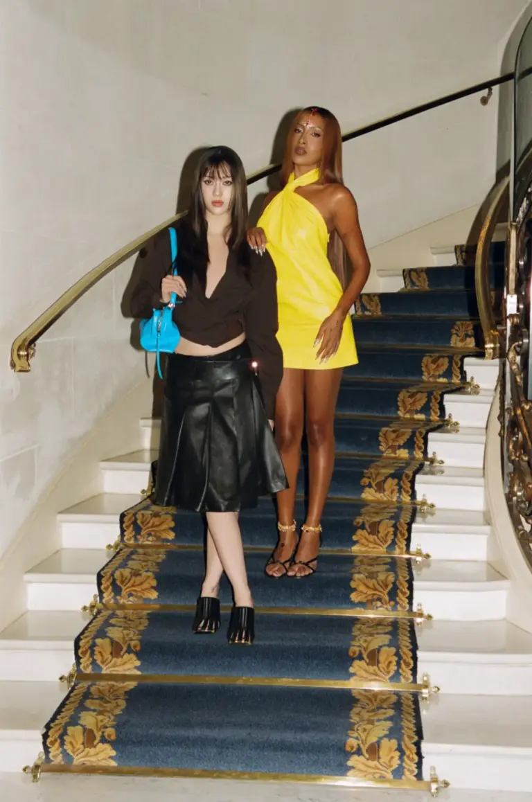
- Footwear and Accessory Integration: The death of the black leather boot and neutral handbag as default choices, replaced by footwear in Yves Klein blue, cherry red, and marigold yellow.
Final Verdict: The reign of beige is officially over. The Spring/Summer 2027 collections have issued a definitive challenge to fashion consumers everywhere: step out of the shadows, ditch the neutrals, and embrace the full, unbridled spectrum of the rainbow. Your closet—and your mood—will never be the same.