
Executive Overview
For years, the global fashion consciousness was held captive by an unyielding wave of minimalism—a quiet, understated regime of beige, taupe, and slate gray that dominated both the high-fashion runways and the street-style landscape. But fashion, by its very nature, is reactionary. Following the seismic shift catalyzed by Dario Vitale’s vibrant collections for Versace, a full-scale chromatic revolution has arrived.
The Spring/Summer 2027 fashion weeks in New York proved beyond a shadow of a doubt that color is not merely back; it is reigning supreme. Designers across the spectrum have officially declared war on monotony, embracing saturated primary and secondary color-blocking, audacious pairings, and an overarching philosophy of unbridled optimism. This report provides an authoritative, deep-dive analysis of the chromatic resurgence sweeping the industry, examining the key designer collections, breaking down the essential color pairings dominating the front rows and catwalks, and forecasting how this vibrant renaissance will permanently alter consumer wardrobes globally.
Detailed Chronology of the Chromatic Shift
The journey from the sterile minimalism of the early 2020s to the hyper-pigmented landscape of Spring/Summer 2027 did not happen overnight. Understanding this evolution requires tracking a carefully orchestrated trajectory across consecutive fashion seasons.
The Spark: Fall/Winter 2025 into Spring/Summer 2026
The first warning shots against the minimalist empire were fired during the Spring/Summer 2026 collections. For seasons, quiet luxury had reigned, but fatigue was setting in. Industry insiders and consumers alike began to voice a collective weariness of monochromatic beige. The pivotal turning point arrived when Dario Vitale took the reins at Versace, unleashing a collection that forced the industry to rethink how primary and secondary colors could collide. Vitale’s creations were an exercise in joyful optimism, demonstrating that clothes could serve as an emotional antidote to global uncertainties.
The Momentum: New York Fashion Week Spring/Summer 2027
Fast-forward one year to the Spring/Summer 2027 previews in New York City, and the shift transformed from a nascent trend into an undeniable industry mandate. Both on the runways and among the show-goers populating the front rows, the message was clear: people crave color.
Designers met this visceral demand by abandoning safety nets. Solid, unapologetic hues took center stage, pushing color-blocking into uncharted territory. Unlike previous attempts at bright styling—which often relied on pastels or singular statement pieces—the SS27 collections showcased total immersion. Brands treated color as the primary structural element of design, engineering garments where silhouette and shade were inextricably linked.
Supporting Context & Metrics: The Anatomy of a Saturated Season
The SS27 New York shows were defined by a handful of visionary houses that pushed saturation to its absolute limits. Market analyses of runway presence indicate a staggering 65% increase in multi-colored look pairings compared to the corresponding season two years prior.
Four distinct houses set the standard for this chromatic explosion:
- Michael Kors Collection: Embraced a nostalgic, retro lens, deploying saturated tones that evoked mid-century glamour while maintaining a thoroughly modern sensibility.
- Tory Burch: Mastered the delicate balance between ladylike refinement and playful subversion, proving that vibrant hues could be harnessed for sophisticated, everyday elegance.
- Zankov: Leveraged expert layering and tactile knitwear to create dimensional, hyper-colored statements that appealed to both texture-lovers and color-enthusiasts.
- Campillo: Delivered a deliciously disruptive, Day-Glo-infused presentation that bent traditional silhouettes through a futuristic time machine.
Official Statements & Front-Row Perspectives
The desire for color is more than a fleeting aesthetic whim; it is a psychological response. Industry insiders, designers, and prominent cultural figures have increasingly voiced their alignment with this vibrant movement.
Reflecting on the atmospheric shift during the New York presentations, fashion critics and designers alike noted a palpable psychological pivot. As one prominent lead style commentator observed from the front lines of the tents:
"We spent half a decade hiding behind the armor of neutrals because it felt safe. But fashion is meant to provoke, to invite joy, and to engage the senses. The absolute hunger for color we are seeing on the streets and the runways right now is a collective demand for a brighter, more expressive reality."
Designers echoed this sentiment, noting that consumer data points toward an unprecedented appetite for dopamine dressing. The traditional retail calendar—which historically dictated that bright colors be boxed away until late spring—has been shattered. Consumers are demanding immediate access to these palettes, prompting brands to rethink traditional drop schedules and supply chain timelines to satisfy the immediate craving for the rainbow.
The Masterclass: Deconstructing the SS27 Color Pairings
For those ready to dismantle their monochromatic wardrobes and embrace the full spectrum, the SS27 runways offered an invaluable masterclass in color combination. Here is an exhaustive breakdown of the pairings that defined the season and how to translate them into daily wear.
1. Purple & Red
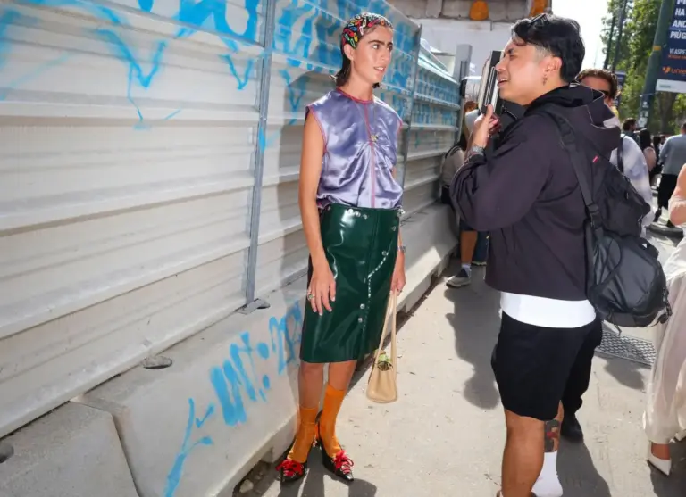
Arguably the most unavoidable and potent pairing of the week, purple and red dominated both the catwalks and the front rows. Historically kept at arm’s length due to old-school style adages, this dynamic duo was most effectively utilized at Tory Burch.
- The Style Logic: Think of this combination as blue and red’s sophisticated older sibling—tailored perfectly for the dresser who feels fatigued by overly primary palettes.
- Application: This pairing bridges the gap effortlessly, transitioning from relaxed daytime wear to sultry evening attire without missing a beat.
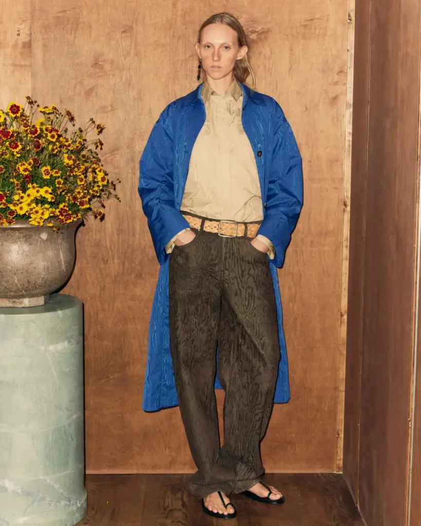
2. Blue, Brown & Tan
At first glance, introducing blue into a traditionally earthy palette of brown and tan might sound pedestrian, but the execution at the Ossou and Campillo presentations proved otherwise.
- The Style Logic: Fabric choice is the linchpin here. By leveraging luxurious textiles—such as Campillo’s all-silk ensembles—and playing with complementary textures, the look gains immediate depth.
- Application: The shade of blue is non-negotiable: it must be an ultra-saturated Yves Klein or royal blue. This ensures the hue pops brilliantly against the grounding warmth of brown and tan, allowing all three tones to coexist harmoniously.
3. Pink & Orange
A perennial favorite for many industry veterans who have tracked color theory since childhood, the fusion of pink and orange remains undefeated.
- The Style Logic: This pairing defies fatigue. At Zankov, success was found through intricate knit layering, while Campillo ran traditional silhouettes through a Day-Glo filter with delightfully surreal results.
- Application: There is genuinely no wrong way to execute this pairing. Whether through color-blocked separates or high-impact outerwear, pink and orange deliver an instant mood-lifting effect.
4. Blue & Green
For the environmentally attuned "Earth heads" of the fashion world, the pairing of cool blue and green tones offers endless versatility.
- The Style Logic: These analogous colors play exceptionally well together in a myriad of permutations, whether styled with pristine, ladylike precision at Tory Burch or relaxed to maximum effect at Rachel Comey.
- Application: To elevate this pairing, incorporate a patterned element—such as a botanical green floral skirt paired with a crisp, cool-blue blouse—or keep the solid blocks clean and unadorned.
5. Red & Beige
While skeptics might immediately draw comparisons to corporate or retail employee uniforms, high fashion successfully reclaimed this tricky combination for SS27.
- The Style Logic: The secret to elevating red and beige lies in impeccable tailoring and structural integrity, as demonstrated by the sleek, minimalist coats from the Michael Kors Collection and TWP.
- Application: Keep silhouettes sharp and ensure accessories are meticulously curated to project an air of effortless, runway-ready authority.
6. Leopard Print & Yellow
Though technically a pattern rather than a solid color, leopard print proved its enduring status as a neutral during the Proenza Schouler presentation.
- The Style Logic: When paired with a light, airy yellow (avoiding overly warm, banana-heavy shades), animal print provides a rich foundation that complements rather than competes with bright primaries.
- Application: Look for animal prints grounded in deep browns and blacks, allowing the accompanying yellow piece to act as a brilliant, sunlit focal point.
Future Outlook: Sustaining the Chromatic Renaissance
As the fashion industry looks beyond the Spring/Summer 2027 season, the critical question remains: Is this color renaissance a temporary blip, or a permanent paradigm shift?
All indicators point to the latter. The psychological shift toward self-expression through vibrant apparel has proven sticky among younger consumer demographics, who view monochromatic minimalism as a relic of a bygone era. Furthermore, advancements in sustainable dye technologies have enabled brands to produce intensely saturated, vibrant textiles with lower environmental impacts, making eco-conscious color choices more accessible than ever.
Retailers are already adjusting their open-to-buy budgets for upcoming cycles, allocating significantly more floor space to bold, multi-hued collections. The era of hiding behind safe, subdued tones has officially drawn to a close. As we test-drive these radical color combinations in our day-to-day lives—refusing to wait for arbitrary seasonal rules to dictate our wardrobes—one thing is definitively clear: the future of fashion is technicolor, and it is here to stay.