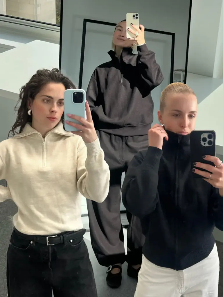
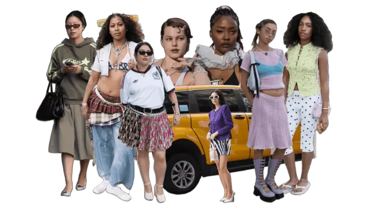
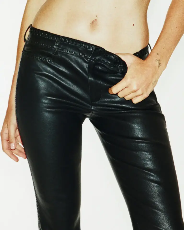
Historically, the transition from summer’s sun-drenched brightness to autumn’s crisp air has triggered a predictable sartorial retreat. Year after year, wardrobes across the globe migrate toward the safety of charcoal grays, deep blacks, and muted utility tones. This chromatic withdrawal has long mirrored nature’s own cycle—the vibrant greens and blooming florals of summer fading into the austere, monochromatic landscape of late-year weather. Yet, as the fashion industry sets its sights on the Fall/Winter collections, a radical subversion of this seasonal tradition is taking place.
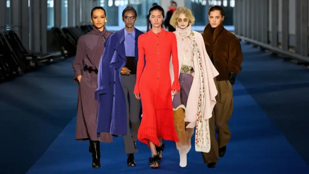
Consider the sheer irony of the natural world: while autumn trees put on a spectacular, high-octane display of blazing scarlets, golden ambers, and fiery oranges, human fashion has historically opted for the shadows. This year, however, luxury design houses and contemporary labels alike are breaking free from the shackles of grayscale monotony. Visionaries from Chloé and Valentino to Celine and Tory Burch have engineered a vibrant recalibration of cold-weather dressing.
While traditional foundation pillars such as rich brown and structured navy remain anchored in the seasonal lexicon, they are now sharing space with electrifying newcomers. These fresh hues do not merely coexist with traditional autumnal shades; they enhance, challenge, and elevate them. From the enduring dominance of tomato red to the psychological warmth of chocolate brown, the soft romanticism of strawberries and cream, and the authoritative royalty of deep purple, Fall 2026 is officially the season of chromatic liberation.
This comprehensive report examines the five defining color trends shaping the global fashion landscape for Fall/Winter 2026, analyzing their runway origins, strategic styling implications, and long-term trajectory in the contemporary consumer market.
Detailed Chronology: The Evolution of the 2026 Runway Palettes
The roadmap for the Fall/Winter 2026 color trends was charted months in advance during the international ready-to-wear fashion weeks. Designers faced a unique cultural dichotomy: a consumer base craving the comforting familiarity of heritage shades balanced against a palpable desire for expressive, dopamine-inducing joy through clothing.
Phase One: The Reign of High-Impact Neutrals (Late Winter Pre-Collections)
The early indicators of the 2026 shift appeared in pre-fall presentations, where designers began experimenting with deep, saturated tones that could function as pseudo-neutrals. Traditional khaki was systematically sidelined in favor of hyper-rich espresso and chocolate browns, signaling an appetite for tactile, grounding colors. Simultaneously, midnight navy emerged not merely as an alternative to black, but as an elevated standard of sophistication, drawing heavily on equestrian and collegiate influences that felt both timeless and remarkably fresh.
Phase Two: The Chromatic Injections (Runway Weeks)
As the main Fall/Winter collections debuted on the runways of New York, London, Milan, and Paris, the palette expanded exponentially. Tomato red—a poppy, orange-undertoned scarlet that has defied seasonal logic by remaining relevant for four consecutive years—asserted its dominance across outerwear, tailoring, and footwear. Rather than treating red as an accent reserved for eveningwear, designers integrated it into daytime uniforms as a primary neutral.
By the time presentations reached Milan and Paris, secondary color narratives had solidified. The romanticism of pop-culture narratives earlier in the year heavily influenced the emergence of "strawberries and cream"—a gradient of blushes, dusty roses, and pale creams (anchored by Pantone’s Cloud Dancer). Finally, royal purple emerged as a dark horse contender, creeping onto the scene through accessories, dramatic outerwear, and full monochromatic tailoring at houses like Celine and Loewe.
Supporting Context & Metrics: The Anatomy of the Five Core Trends
To truly understand how these colors function within a modern wardrobe, we must examine each trend through its specific psychological weight, pairing potential, and styling applications.
1. Tomato Red: The Unstoppable Neutral
Despite its inherent association with warning lights and stop signs, tomato red is proving to be the most enduring color phenomenon of the decade. Unlike its earthier, wine-toned cousin burgundy, tomato red carries an effervescent warmth that instantly elevates any ensemble with an editorial edge.
The Appeal: It commands immediate visual attention without feeling overly costumey. It acts as a lightning rod for the gaze, making it the ultimate tool for statement pieces.
Optimal Color Pairings: Black, taupe, cream, and navy.
Strategic Substitution: Wear tomato red instead of burgundy. While both offer warmth, tomato red provides a sharper, more modern contrast against traditional dark autumnal fabrics.
Accessible Integration: For consumers hesitant to commit to head-to-head red tailoring, the trend has been democratized through accessories and foundational basics. Think of a structured Gap CashSoft oversized V-neck sweater, a minimalist Sézane bright red Conrad T-shirt, or the unexpected streetwear crossover of Adidas Tokyo low-top sneakers in vibrant crimson.
2. Midnight Navy: The Sophisticated Alternative to Black
Described deliberately as "midnight navy" rather than a sorrowful blue, this shade taps into the academic, preppy, and equestrian aesthetics that continue to dominate contemporary street style. It offers the slimming, grounding benefits of black while introducing a rich, light-catching depth that feels far more modern.
The Appeal: Calm, collected, and inherently mature, midnight navy bridges the gap between utilitarian workwear and high-fashion tailoring.
Optimal Color Pairings: Cream, metallic gold, tomato red, and soft pinks.
Strategic Substitution: Use midnight navy as a direct replacement for black in outerwear and suiting.
Key Investment Pieces: The market reflects this shift through structured essentials, such as the J.Crew relaxed sweater-polo in navy-ivory, Anine Bing’s fluid bar maxi skirt, Hill House’s architectural Winsome Dress, and classic outerwear silhouettes like Everlane’s cotton-twill Mac coat.
3. Chocolate Brown: The Grounding Force
Chocolate brown is a certified cold-weather classic, yet its 2026 iteration feels entirely revitalized through texture and silhouette. No autumn wardrobe is currently considered complete without at least one espresso-toned garment, whether manifested in butter-soft leather, rich suede, or plush merino wool.
The Appeal: It introduces immediate visual warmth and depth, providing a softer alternative to stark black while maintaining a luxurious finish.
Optimal Color Pairings: Tomato red, lavender, burnt orange, and ivory.
Strategic Substitution: Swap out traditional khaki for rich chocolate brown. The deep contrast offers a much more seasonally appropriate, moody foundation for fall textures.
Standout Market Offerings: Banana Republic’s merino cardigan sweater, Dôen’s equestrian-inspired Elowen skirt with delicate cream lace detailing, and Quince’s Italian leather block heel boots in coffee bean.
4. Pink & Cream: Sweetness in the Darkening Evenings
Counterbalancing the heavy, grounding tones of brown and navy, the pairing of romantic pinks and pristine creams (typified by Pantone’s Cloud Dancer) introduces a much-needed luminosity to late-year wardrobes. Inspired by cultural shifts toward romance and softness, designers from Valentino to Chloé showcased gradients moving seamlessly from pale blush to dusty rose and baby purple, anchored by creamy neutrals.
The Appeal: It softens the severity of winter dressing, offering an optimistic, ethereal counter-narrative to cold-weather utility.
Optimal Color Pairings: Classic blue denim, rich chocolate brown, and bright white.
Strategic Substitution: Replace heavy burgundy pieces with structured pink knitwear for a softer, more dimensional look.
Styling Imperative: Texture is paramount when working with this palette. To prevent pink and cream from feeling overly juvenile, garments must rely on elevated tactile elements such as pure silk, fine-gauge cashmere, and heavy-weight corduroy—exemplified by Aritzia’s Bare Cashmere short-sleeve cardigan and J.Codes Zoe barrel pants in pale bone.
5. Royal Purple: The New "It" Color
Trailing closely behind tomato red in terms of sheer cultural impact, royal purple is staging a massive takeover. Historically reserved for royalty due to the extreme expense and scarcity of its original dye sources, purple retains an inherent psychological weight of power, luxury, and self-assurance.
The Appeal: It provides a striking middle ground between the warmth of red and the coolness of blue, making it an extraordinarily versatile statement shade for eveningwear and daytime layering alike.
Optimal Color Pairings: True black, pristine cream, and accents of tomato red.
Strategic Substitution: Wear royal purple as a high-fashion alternative to red when looking for a less expected color pop.
Market Adoption: High-street and luxury brands alike have embraced the shade, ranging from J.Crew’s oversized cashmere crewneck sweater in tetra purple to Boden’s 5-pocket cord column jeans in deep grape and Cos’s architectural draped turtleneck maxi dress.
Official Statements & Industry Perspectives
The departure from traditional autumn palettes has been championed by creative directors and trend forecasters across the globe, who view this chromatic shift as a direct response to changing consumer psychology.
"We are witnessing a collective weariness of monochromatic safety," notes leading fashion forecaster Elena Vance. "Consumers no longer want to hide behind black and gray during the colder months. Color has become a primary vehicle for self-expression, mental wellness, and joy. The Fall 2026 runways proved that vibrancy is no longer tethered strictly to the calendar months of summer—it is a year-round state of mind."
Design houses have echoed this sentiment, emphasizing that vibrant colors in cold-weather fabrics—such as heavy wool, boiled cashmere, and structured leather—create a luxurious juxtaposition that traditional summer colorways cannot replicate.
"When you render a fiery tomato red or a deep royal purple in heavyweight cashmere or structured gabardine, the color takes on an entirely new gravitas," explains a senior design lead at a major European luxury house. "It bridges the gap between whimsical expression and timeless elegance."
Future Outlook: The Longevity of the 2026 Color Spectrum
As the fashion industry looks beyond the immediate autumn season, the implications of these color trends point toward a permanent structural shift in how seasonal collections are merchandised. The traditional rigid boundaries—where brights belong exclusively to spring/summer and mutes belong to fall/winter—are officially dissolving.
Year-Round Saturation: Expect to see these foundational shades—particularly tomato red and chocolate brown—transcend their seasonal categorizations, carrying forward into resort and spring collections as perennial neutrals.
The Rise of Unexpected Pairings: The Fall 2026 mandate encourages high-contrast color blocking. Consumers are increasingly confident in pairing opposing tones—such as chocolate brown with tomato red, or royal purple with soft cream—shifting away from match-dependent dressing toward eclectic personal curation.
Sustainable Investment in Color: Because colors like midnight navy, chocolate brown, and royal purple carry strong heritage associations, consumers are more willing to invest in high-ticket outerwear and tailoring in these shades, viewing them as long-term wardrobe anchors rather than fleeting micro-trends.
Ultimately, Fall 2026 marks the end of the chromatic hibernation. By embracing everything from the fiery punch of tomato red to the quiet luxury of midnight navy and chocolate brown, modern dressing has proven that warmth and vibrancy are not mutually exclusive. As these shades filter from the runway to the mainstream, the message to consumers is clear: step out of the shadows, lean into the spectrum, and let your wardrobe match the brilliant complexity of the world around you.


.jpg)