
Executive Overview
For the better part of a decade, contemporary style was governed by a strict, almost monastic code of restraint. The 2020s became synonymous with "quiet luxury"—a socio-aesthetic movement defined by greige palettes, understated silhouettes, and the whisper-wealth signaling of neutral-toned staples meant to last a lifetime. Kendall Jenner, Zoë Kravitz, and Hailey Bieber served as the high-priestesses of this understated epoch, rendering color an afterthought, a mere "pop" of red slung over a shoulder or a muted jade-green accent bag.
However, the tectonic plates of global fashion shifted irrevocably on September 26, 2025, in Milan.
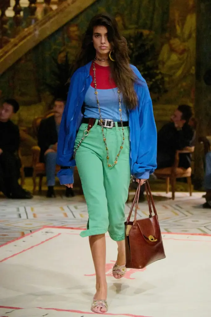
When designer Dario Vitale sent his debut Spring/Summer 2026 collection down the Versace runway, it wasn’t just a stylistic departure; it was a cultural shock therapy. Opening with a royal-blue cotton bomber jacket layered over a red-and-cornflower-blue shirt-tank hybrid and anchored by sea-foam-green capri pants, Vitale subverted modern tailoring norms entirely. It was loud, it was clashing, and it was unapologetically saturated.
In the months that followed, this defiant embrace of pigmentation swept from the major European capitals to the global retail market. The Fall/Winter 2026 runways confirmed what the street style stars and avant-garde labels had already signaled: "quiet luxury" has officially been put to rest. In its place rises a vibrant, emotionally charged era of maximalism, color-blocking, and sensory disruption. Color is no longer an accent piece; it is the entire architecture of modern dress.
Detailed Chronology: The Fall of Neutrals and the Rise of the Rainbow
The reclamation of the rainbow did not happen overnight, but its acceleration can be mapped across a precise timeline of runway coups and creative-director shakeups.
September 2025: The Milan Catalyst
The paradigm shift originated at Versace during Milan Fashion Week Spring/Summer 2026. Amid a tumultuous season of creative-director musical chairs, Dario Vitale’s debut stood out not merely for its audacity, but for its psychological timing. For years, consumers had been lulled into safety by beige cashmeres and minimalist tailoring. Vitale’s vision—drawing heavily from 1980s power dressing, preppy subversions, and classic Gianni Versace maximalism—introduced an electric intermediate palette: shades that avoided the saccharine nature of pastels while bypassing the abrasive screech of neon.
Critics were immediately polarized. The juxtaposition of teal, neon blue, and lilac alongside unexpected triads of red, green, and blue challenged conventional notions of good taste. Yet, the retail reality quickly silenced skeptics. Editors and influencers descended upon the pieces with a voracious appetite, turning Vitale’s audacious palette into one of the most commercially coveted drops of the season.
January–June 2026: Menswear and Mid-Year Momentum
The contagion quickly spread across categories. By the Men’s Fashion Week in June 2026, brands like Auralee refined their proprietary color combinations, while Jonathan Anderson introduced startlingly vibrant baby-pink trousers at Dior, proving that gender lines in chromatic expression were dissolving.
Simultaneously, independent houses and legacy brands alike abandoned their safe zones. The global consumer, fatigued by years of monotonous dressing, began to mirror the runway shifts. Retailers reported unprecedented spikes in sales for garments featuring high-saturation mint, turquoise, and magenta.
Fall/Winter 2026: The Global Saturation
By the time the Fall/Winter 2026 womenswear collections hit Paris, New York, and London, the transformation was complete. The runways read like a manifesto against monotony:
- New York: Zankov championed eccentric, wacky styling that defied traditional winter drabness.
- Paris: Meryll Rogge made a sensational debut at Marni by pairing traffic-cone-orange dresses with hunter-green parkas. Marie-Adam Leenaerdt and Mugler introduced piercing neon hues, while Vaquera sent highlighter-yellow shift dresses down the catwalk.
- The Tailoring Shift: Saint Laurent fused hot red and orange within a single look, and Issey Miyake’s Satoshi Kondo unleashed a suite of neon trench coats that demanded spatial and visual dominance.
Crucially, the styling philosophy shifted. The objective was no longer to find a single striking garment to anchor a neutral outfit, but rather to construct entire ensembles where multiple high-saturation hues vied for dominance.
Supporting Context & Metrics: The Death of "Good Taste" and the Economics of Emotion
To understand why color has made such a violent and triumphant return, one must analyze the socio-cultural pendulum of the 2020s.
The Exhaustion of Quiet Luxury
The "quiet luxury" movement was born out of economic uncertainty and post-pandemic craving for stability. It favored timelessness, minimalism, and invisible branding. However, as cultural cycles accelerate, the pursuit of immaculate, inoffensive taste inevitably breeds creative asphyxiation.
Industry data from major luxury e-commerce platforms throughout late 2025 and 2026 indicated a sharp decline in year-over-year growth for monochromatic, neutral-heavy capsules, contrasted by double-digit surges in demand for statement-colored outerwear, knitwear, and accessories. Shoppers were no longer looking to blend into boardroom-friendly anonymity; they sought emotional resonance through dress.
Color Theory and the Psychology of Rebound
Fashion is fundamentally reactionary. As Lizzie Owens, head of design at contemporary label 6397, observes, the industry has spent years trapped in a "good taste" era characterized by quiet, unapologetically wealthy aesthetics.
"The pendulum is moving toward creative expression, emotion, even messiness," Owens explains. "And it’s not just a feeling—color theory backs it up. Our eyes and brains respond to color emotionally: butter yellow calms you down; bright canary yellow excites you."
This psychological craving explains why designers are bypassing traditional trend forecasts and Pantone color-of-the-year announcements. The selection of hues for collections designed a year in advance has become an exercise in pure instinct—an intuitive reaction to a geopolitical and social landscape that feels increasingly volatile. As Owens notes: "The world is burning, so why not spice it up?"
Official Statements & Industry Perspectives
The tectonic shift toward chromatic expression has been met with profound enthusiasm by the creative minds defining contemporary fashion.
The Instinctive Palette: 6397’s Spring/Summer 2026 Vision
For 6397, the color revolution wasn’t a calculated marketing maneuver; it was an artistic imperative. According to Lizzie Owens, color became impossible to ignore starting in the spring of 2026.
"F26 worked the same way: turquoise, purple, peach announced themselves before concept, before the fabric," Owens shares. "Something about 2026 was shouting for color."
By injecting mint, Pink Panther pink, and turquoise into its foundational wide-leg denim and shirting, 6397 demonstrated that even utilitarian, everyday garments benefit from emotional saturation. Owens stresses that true color curation transcends data analytics:
"Choosing a palette for something that won’t be seen for over a year is pure instinct, emotion, almost a sixth sense. You can’t overthink it, and it’s definitely not about subscribing to color trend reports… You have to tap into something beyond the usual level of consciousness to feel it before you can even name it."
The Masters of the Craft
While the 2026 color explosion feels novel to mass-market consumers, it builds upon the enduring legacies of fashion’s master colorists. Dries Van Noten remains the undisputed gold standard, effortlessly harmonizing disparate shades of burgundy, hot pink, and green. His successor, Julian Klausner, has successfully maintained this mantle, proving that sophisticated color-clashing requires architectural precision.
Similarly, American designer Christopher John Rogers continues to anchor the pattern-and-color conversation with world-class knitwear and taffeta creations that defy seasonal predictability, securing his place in wardrobes that reject convention.
Future Outlook: How to Navigate the Technicolor Era
As this chromatic renaissance permeates mainstream culture, its influence is no longer confined to high-fashion runways. Pop culture’s leading arbiters have rapidly adopted the look.
- Charli XCX, despite navigating a self-described "goth" era, donned a custom aqua-blue Chrome Hearts set for her "Wink Wink" music video and rocked an eggplant-purple cinched minidress from 7 for All Mankind—solidifying the silhouette as a Fall/Winter 2026 staple.
- Hailey Bieber, long considered an ambassador of neutral minimalism, made headlines by stepping out in a vibrant, lacy vintage yellow top.
- Dua Lipa, Pamela Anderson, and Zara Larsson continue to treat festival stages and red carpets as laboratories for kaleidoscopic expression.
The Consumer Playbook for the Saturation Age
For those looking to transition out of the era of greige and embrace the new chromatic reality, fashion experts recommend abandoning traditional styling rules:
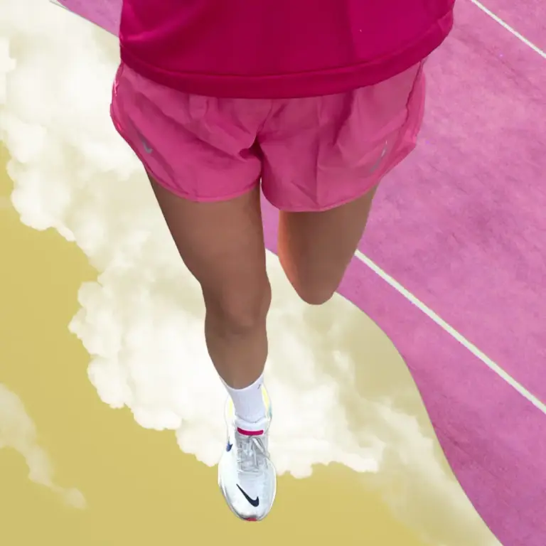
- Embrace Monochromatic Day-Glo: Do not fear total-body saturation. Wearing a single, blinding shade from head to toe commands space and exudes confidence.
- Master Intentional Clashing: Toss out the safety net of pairing a bold piece with a neutral base. Instead, experiment by combining three distinct, high-energy colors that theoretically shouldn’t work together—such as traffic-cone orange with hunter green, or royal blue with sea-foam green.
- Play with Textures: When mixing intense hues, let fabric finish do the heavy lifting. Matte surfaces pair seamlessly with fellow mattes, while strategic touches of gloss, silk, or metallic sheen add depth to the visual narrative.
The era of whispered luxury has drawn to a close. As fashion steps boldly into a technicolor future, the directive is clear: let go of caution, silence the critics, and inject maximum color into a world that desperately needs to feel again.